Where Impact is more than just a font.
summary
Art direction, visual identity and website for Changemakers Camp — a Vienna-based conference for people who want to challenge the status quo.
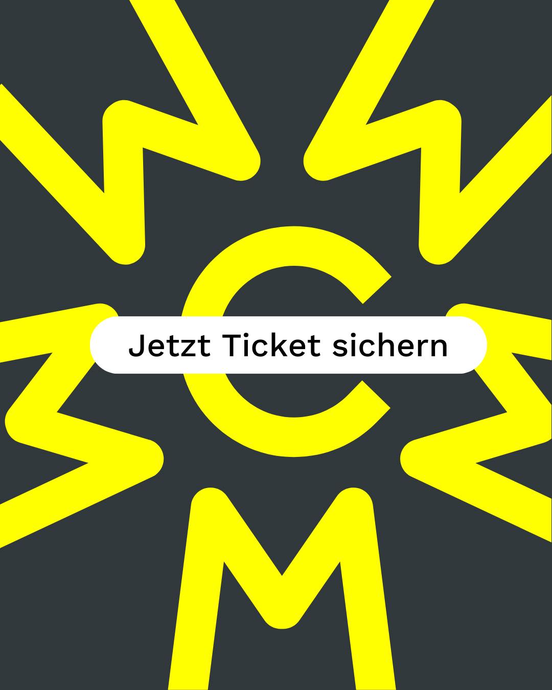
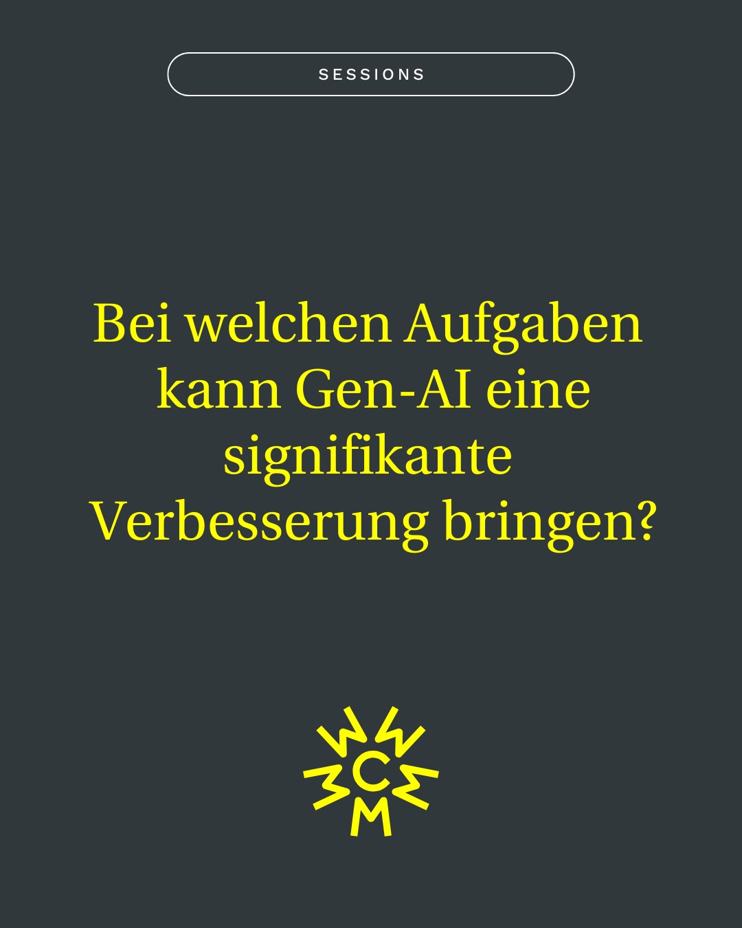
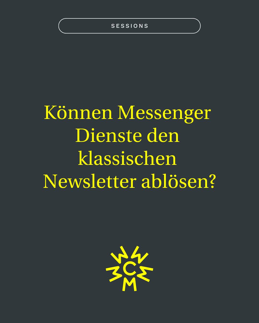
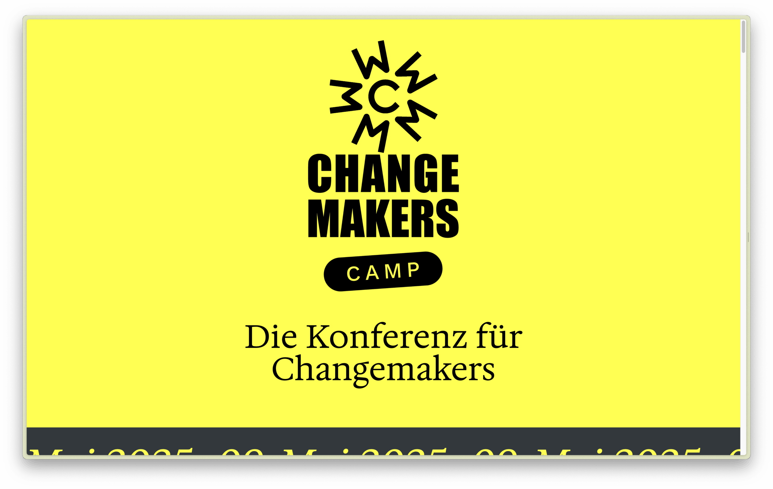
The system is bold, modular and built for real-world use, with Impact at its core and a bright activist yellow tying it all together.
The branding uses bold, simple tools — and makes them work hard: the wordmark is set in Impact, probably the most activist typeface out there. It’s loud, clear, and loaded – from protest signs to meme culture. For a conference about grassroots action and digital movements, it felt like the only right choice.
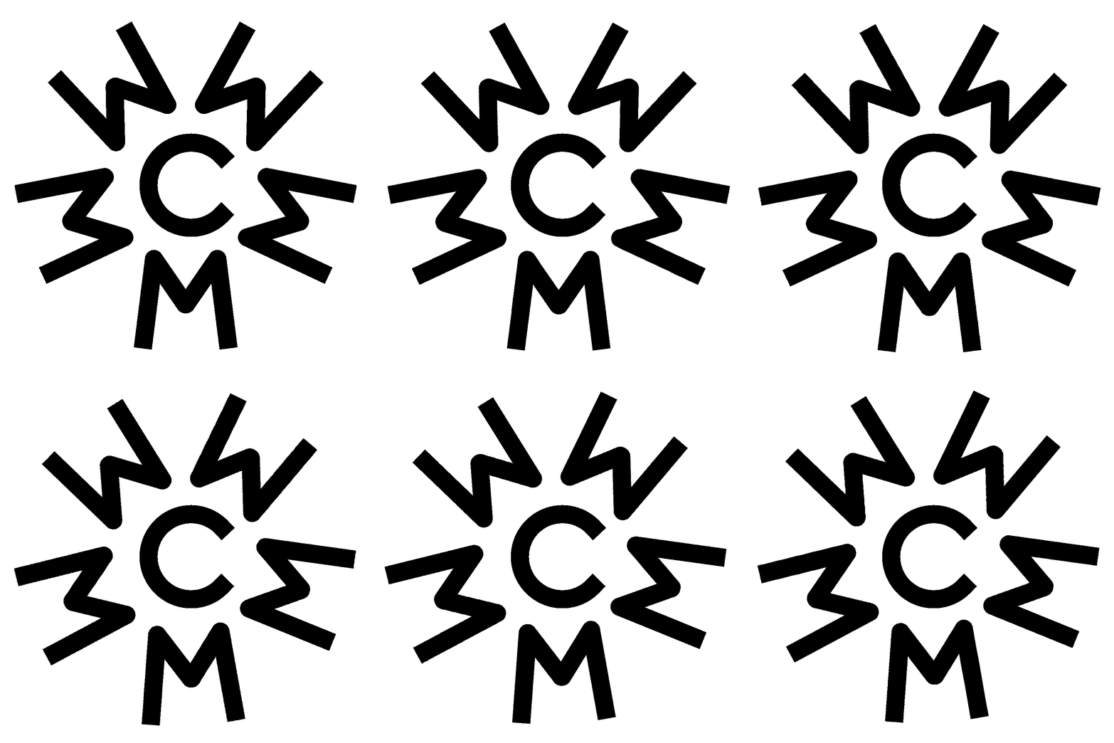
The initials C and M double as a visual structure — and as a subtle reference to the founders themselves. Yellow, as the primary color, ties the project to activist history and positions the brand close to its parent company Change Hive.
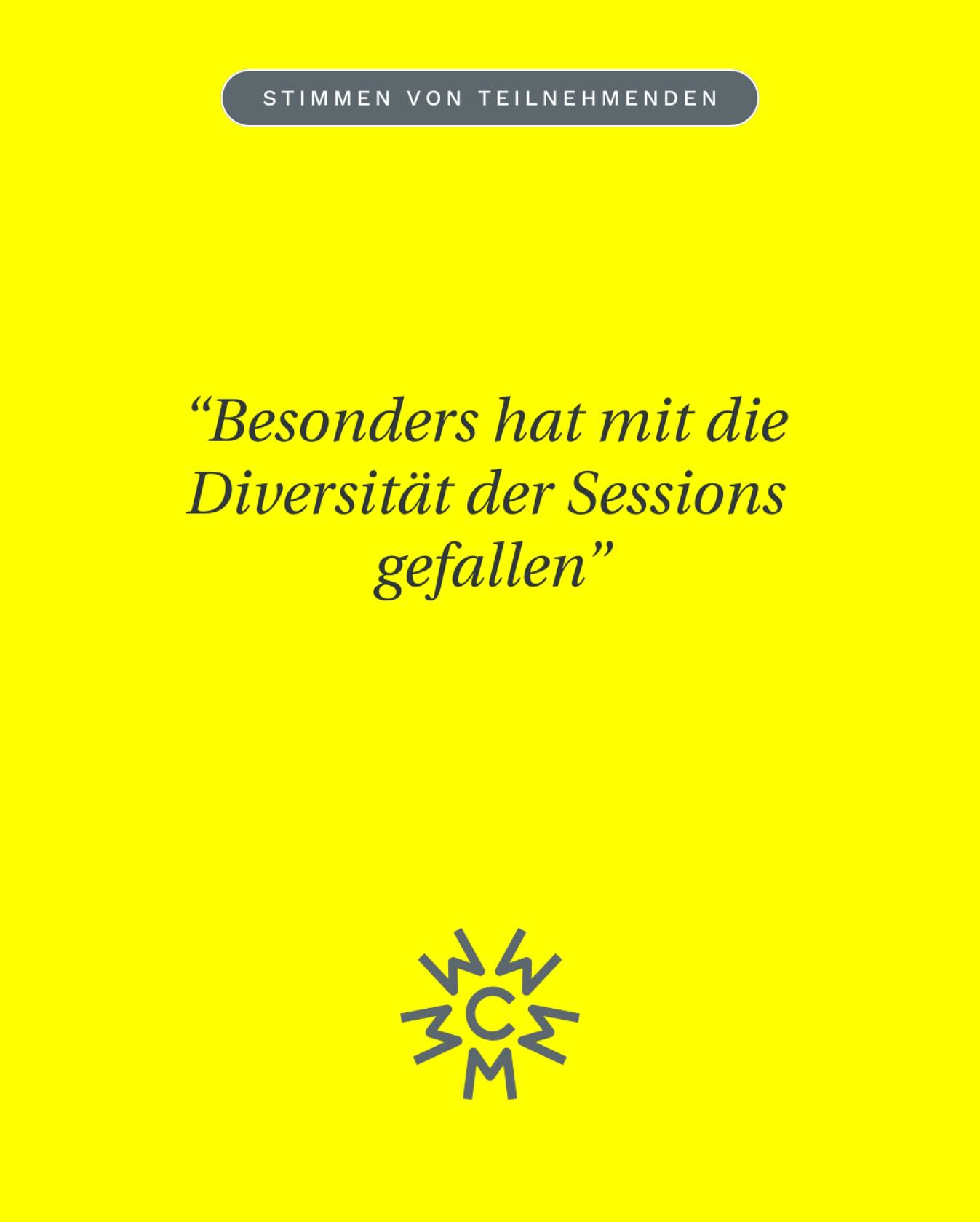
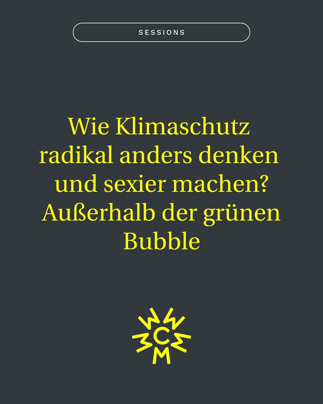
The design system is modular and adaptable: the logo icon gets reused throughout as a background shape, a pattern or a bold framing device. Supporting typefaces include Work Sans for body text and Hedvig Letters Serif for headlines and accents — both freely available fonts, making the system work without licensing costs. A custom faux italic was created to give the serif more voice where needed.
The result: a flexible visual toolkit that’s bold, clear, and designed to be used independently.
creative services
Visual Identity System
Business Essentials
Canva Templates
Webdesign
Affiliation + partners
©brutstadt 2019 – 2026
