
Taxes, type and no BS.
summary
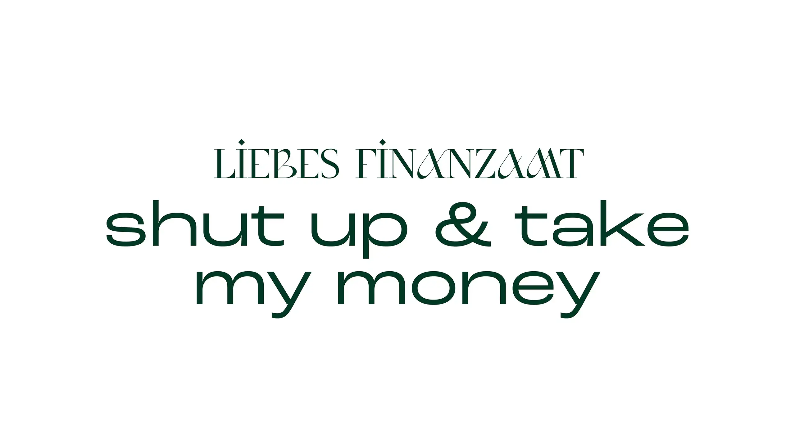
Sharp, structured, and no-nonsense — KÖ approaches tax consulting with clarity and intent. The identity reflects that: refined but approachable — confident without being loud. Saint Monica leads the identity, featuring redrawn dieresis to match the rhythm, supported by Roc Grotesk for all things text. A deep green anchors the system and subtly nods to the founder’s hunting background. The result: a design that feels solid, self-assured, and ready to cut through the noise — just like its founder.
creative services
Visual Identity
Business Essentials


©brutstadt 2019 – 2026